Overview
This section describes Comet.ml's web-based user interface.
Comet.ml organizes all of your runs as Experiments. Workspaces contain Projects which house your Experiments. We will explore each of these concepts in the sections below.
Workspaces
When you first create your Comet.ml account, we create a default workspace for you with your username. This default workspace contains your personal private and public projects. In addition, you can create additional workspaces. Each workspace can have its own set of collaborators.
Info
You can allow collaborators on your personal workspace and create private projects by upgrading your plan. If you ever have any questions, feel free to send us a note at support@comet.ml or on our Slack channel.
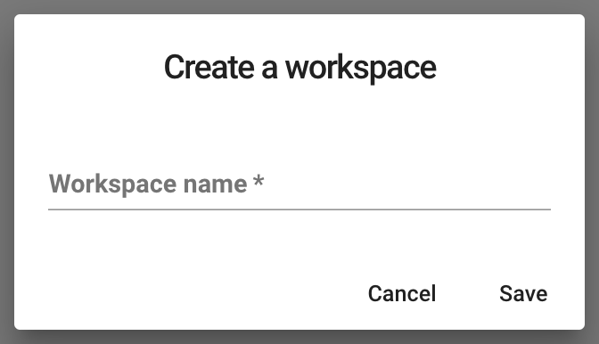
To create a new workspace:
- From any page, click the top right button with your workspace name. Use the dropdown menu
to select
Switch Workspace->View all workspaces
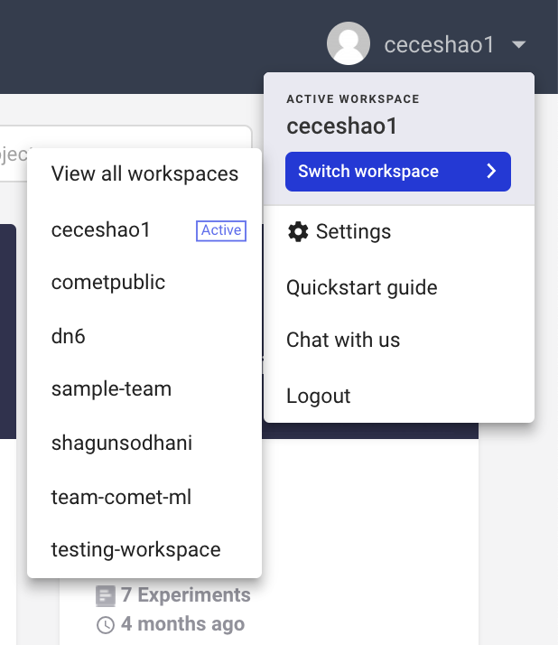
- Click
Create a workspaceto create a new workspace
- Name your workspace and then click the newly created workspace to start using it!
Adding Collaborators to a Workspace
From any page, click the top right dropdown menu with your workspace name (initially your username). Use the dropdown menu to select Settings. From the settings menu choose Collaborators and then click Add Collaborators.
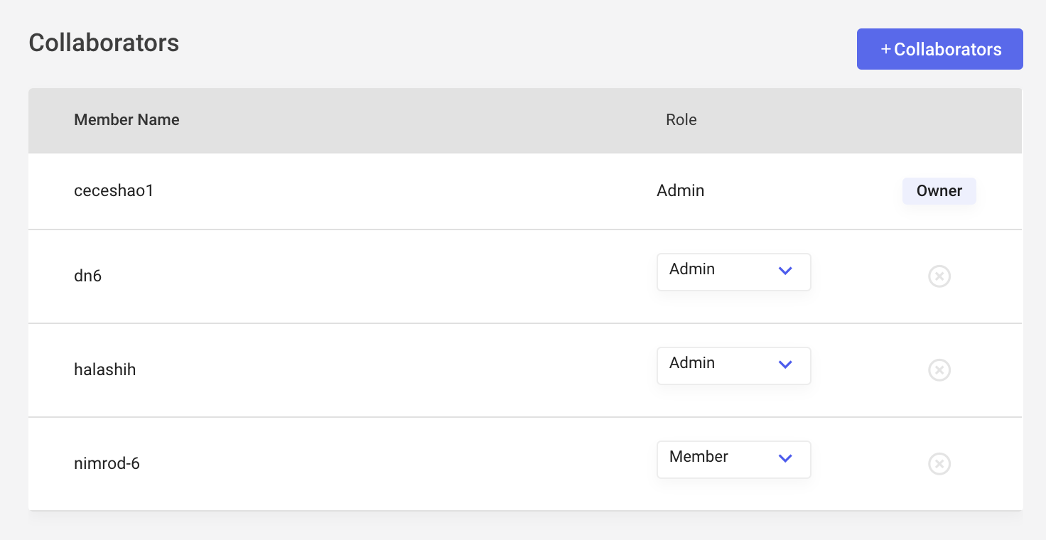
Warning
Workspace projects will automatically be shared and visible to the all the collaborators in the workspace. If you choose to set it to Public it would be also shared with the rest of the world and accessible to anyone who has the direct link to your workspace.
Rotating API Key
Under the Settings page of a workspace, you can see and rotate your API key for your workspace.
-
In the
Developer InformationofSettings, you have access to your API key and API key.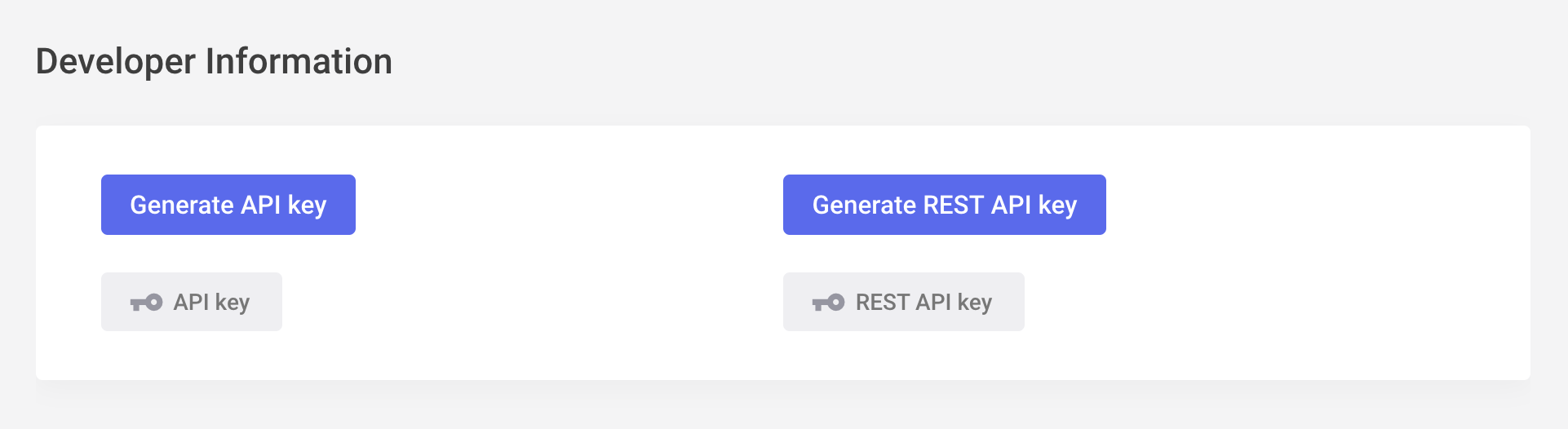
-
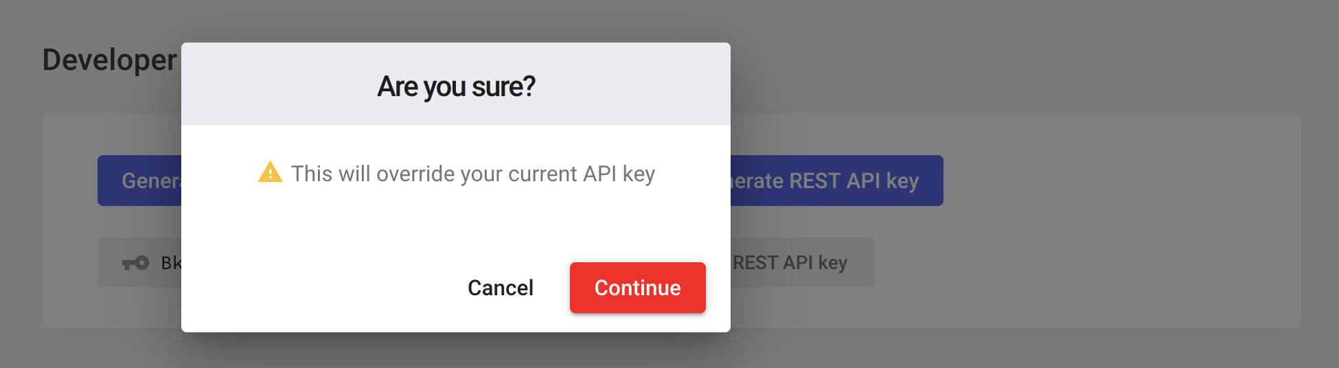
If you want to rotate your API key, click
Generate API keyto replace the existing workspace API key. Then click confirm.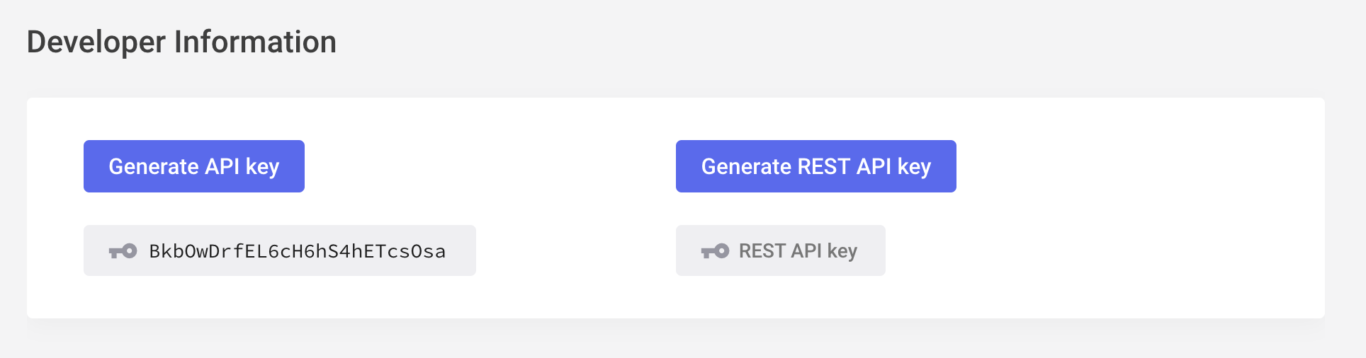
-
A new API key will be generated for your workspace.

If you have any experiments currently started with your old API key, Comet ML will stop collecting information from that run. The old API key will no longer be valid, so be sure to update anywhere you have it.
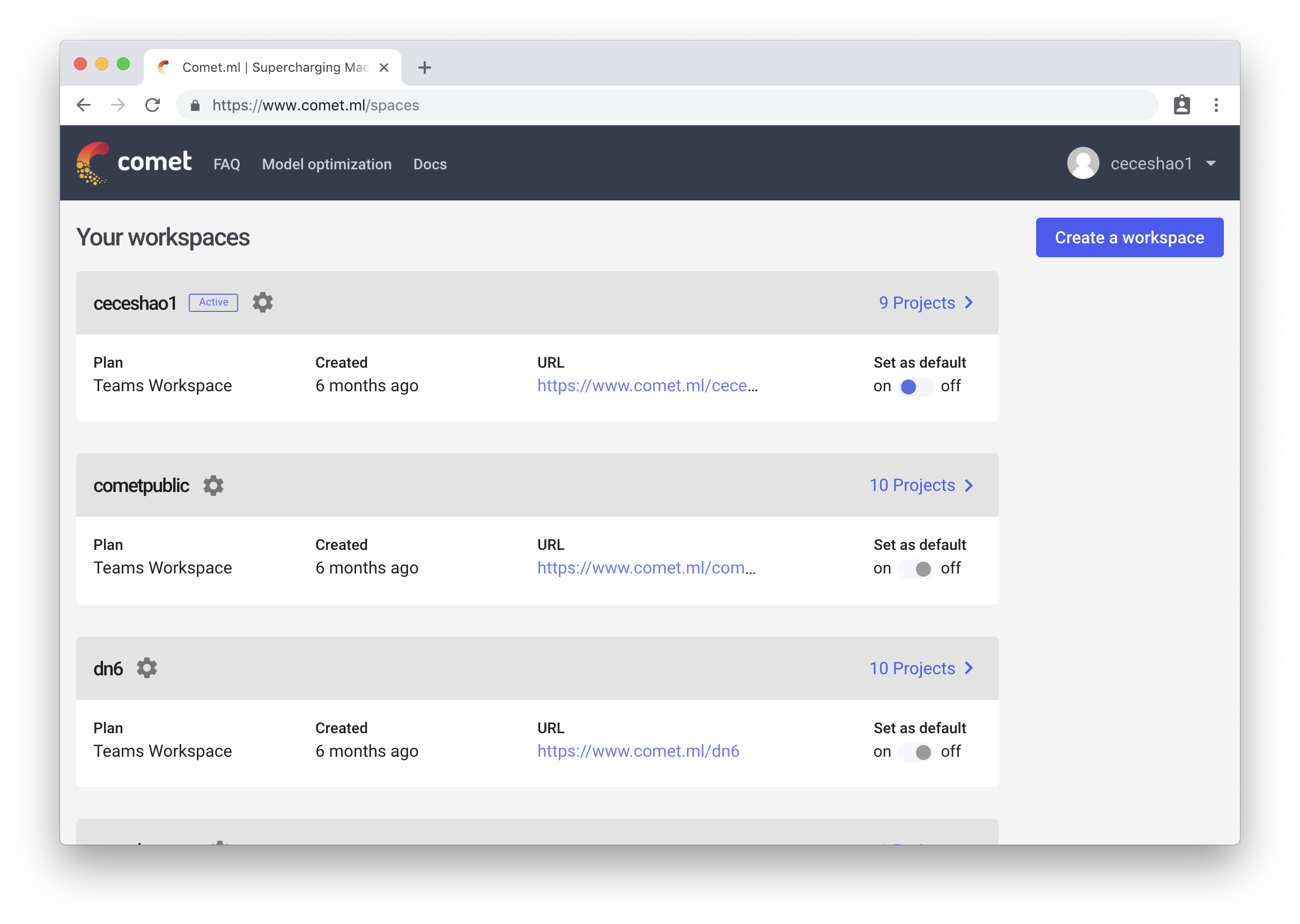
Workspace Views
The Workspace can be displayed as either a grid of Project cards, or in a list. In either view, you can:
- Filter projects by owner, and/or visibility (public vs private)
- Search projects by name or description
- Sort projects by name, last updated, experiment counts, or creation date
In the Project List View, you have access to the config button in the right-most column to:
- Edit a project's name, description, or visibility (public vs private)
- Delete a project
- Share a project
- Change the project's icon image
In the Project Grid View, you have access to the above functionality through the three vertical dots in the upper left-hand corner of each card.
Projects
A Project is a collection of experiments. A Project is either private (viewable and editable by all collaborators with the proper permission level) or is public (editable by the owner, and viewable by everyone). You can set a project’s public/private visibility under the Manage section of the Project View:
Project View
The Project View will be your primary working area at Comet.ml. Here you can manage, select, and analyze all, or subsets, of the project’s experiments.
Your Project View contains tabs to manage your project’s artifacts including:
- Panels: customisable dashboard for all your experiments.
- Experiments: tabular view of all of your experiments.
- Notes: allows you to make notes in markdown on this project.
- Archive: shows all experiments for this project that have been archived. From here you can permanently delete or restore an experiment or group of experiments.
The Project View also presents useful shortcuts to begin logging and sharing experiments such as:
- Add experiment: get detailed code for adding an experiment through the programming SDKs.
- Share: get the shareable URL for this project available in the
Optionssection. Viewers do not need Comet accounts to see the Project View, however, their ability to save adjustments to the Project View is limited.
The first row of the Project View shows breadcrumbs that help you navigate between:
- Current workspace: click it to see all projects in the workspace
- Current project: the name of the current project
There are 5 sections for each project:
- Panels: the main Project view; shows filter, grouping options and project panels
- Experiments: tightly coupled to the panels view; show experiments in a tabular format
- Notes: a page of markdown notes for the project
- Archive: a list of archived experiments for this project
- Manage: control the visibility of a project and create shareable links
- Reports: a list of all reports for this project
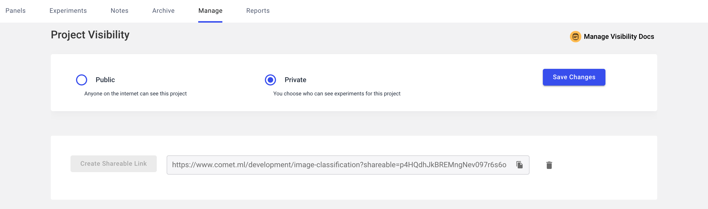
Manage Section
The Manage section allows you to control a project's visibility. Here, you can make a project public (anyone can see the project) or private (you choose who can see the project).
In addition, you can create Shareable Links. These links work, even if a project is private. Each project can have a single, shareable link.
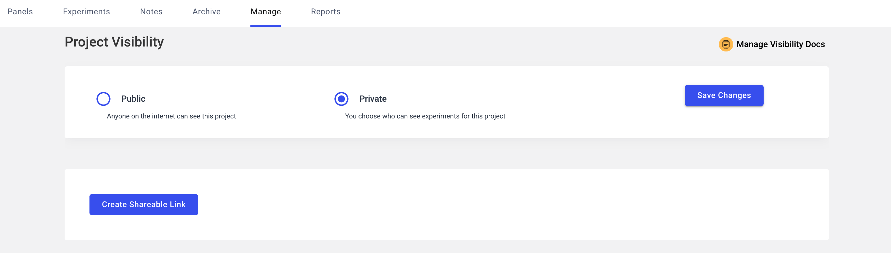
At any time, you can delete a shareable link by clicking the trashcan icon next to the link.
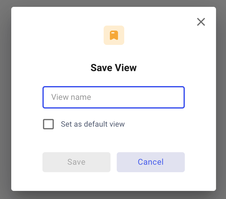
Saving Project Views
As you make changes to your Project View, these changes will be saved temporarily with your current URL. At any time in the future you can decide to save or abandon those changes.

To save a View:
- Click
Save View - Decide to save the view in the current view, or in a new view by selecting "Create new view" and giving it a name
- Click
Save
To abandon a View, simply click the Discard link in the view selector.
If you have made a Project visible (public), then you can share links with a particular view selected. Simply create the view and share the URL. The URL contains information about which view to use.
Info
Items that are saved with the view: selected queries and filters, Experiment Table columns, panels. Items that are not saved: selected areas in panels.
To make a custom view the default for this project:
- Click the
Change Viewdropdown - Hover over the new custom project view option in the dropdown
- Click the check icon to set that view as the default
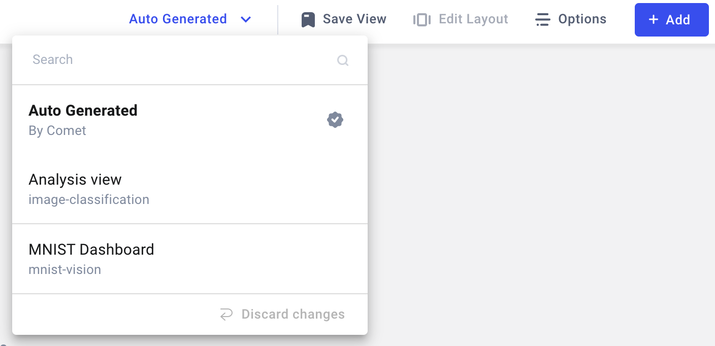
Now the newly saved default view will be used to determine which project view we render for you. At any time you can also delete a project view by selecting it under the view button and clicking the delete icon.
If you make changes to this view and you wish to keep them, you will need to:
- Click
Save View. - Select
Overwrite current viewoption, orCreate new view.

Navigate to the next section of the documentation to learn more about the Experiment Filters and Project Visualizations. We will also cover the Experiments Table in a subsequent section.
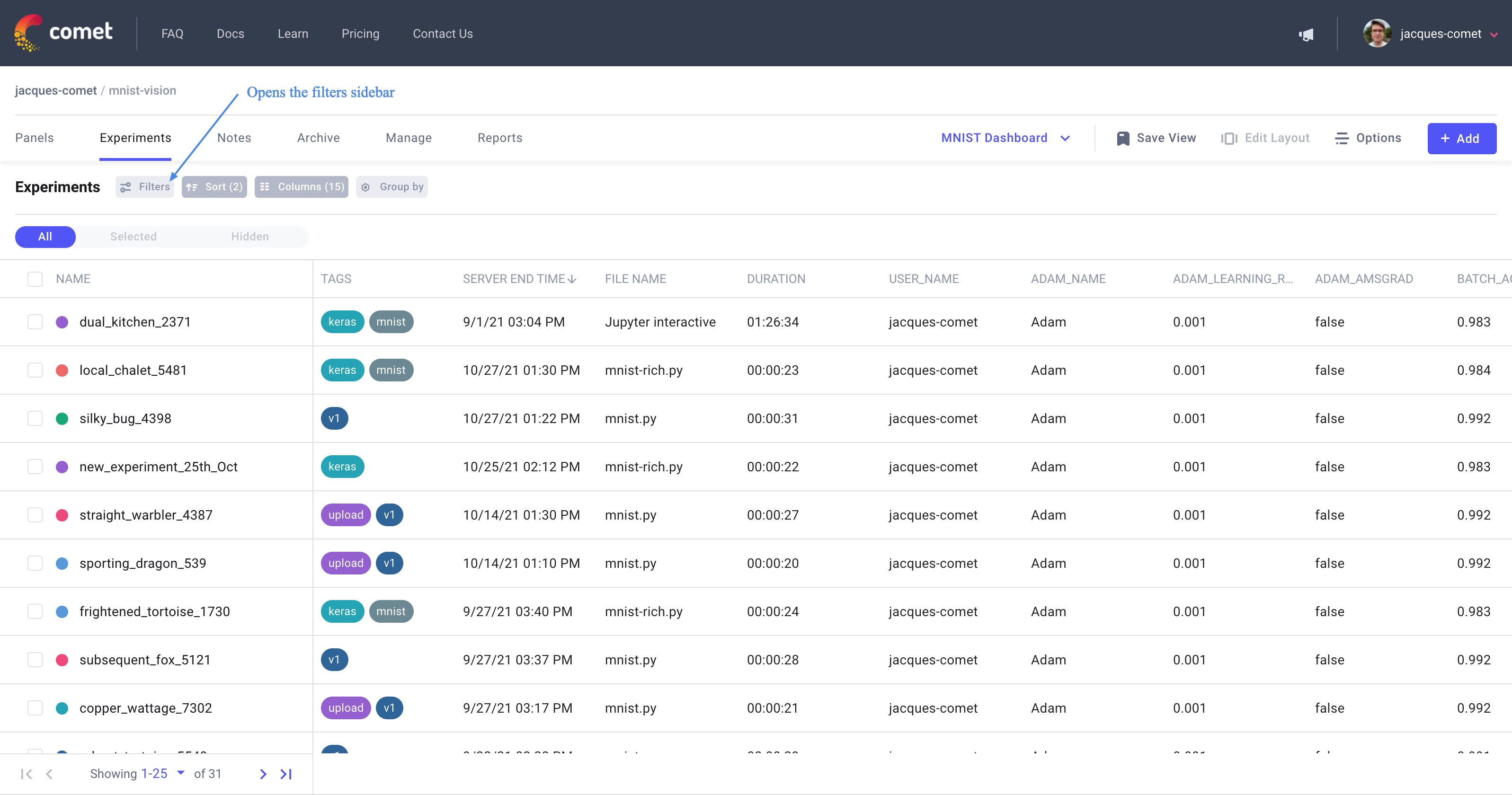
Experiment Filters
The Experiment Filters allow you to select exactly which experiments you would like to see in the Panels and Experiments views and are shared between these two views.
Filters can be defined in either the Panels view or the Experiments view. To begin building and saving filters, open the filters sidebar using the options on the top left of the page.
Adding Filters
Each filter is composed of one or multiple conditions. To add a condition, simply press the + Add filter condition button and select which experiment attribute you would like to set as the filter condition. Depending on the attribute’s data type, we expose different operators such as contains, is null, begins with, boolean values, and more.
Saving and Loading Filters
To save a set of filter conditions, select the Save button on the top of the filters sidebar. You will be prompted with a "Save Filter" modal dialog box where you can enter a Filter name.
If you make changes to a Saved Filter and you wish to keep them, you will need to:
- Click
Save. - Select
Save changes to the filter [Filter Name]…option, orCreate new filter. - Click the
Savebutton.
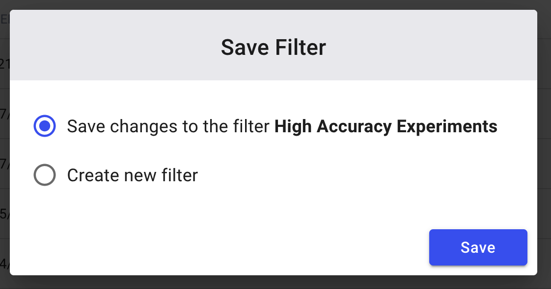
In order to load a saved Filter, open the filters sidebar and open the Load Filter dropdown to expose a list of your Saved Filters. To return to a project view with all experiments, click the Clear button in the filters sidebar.
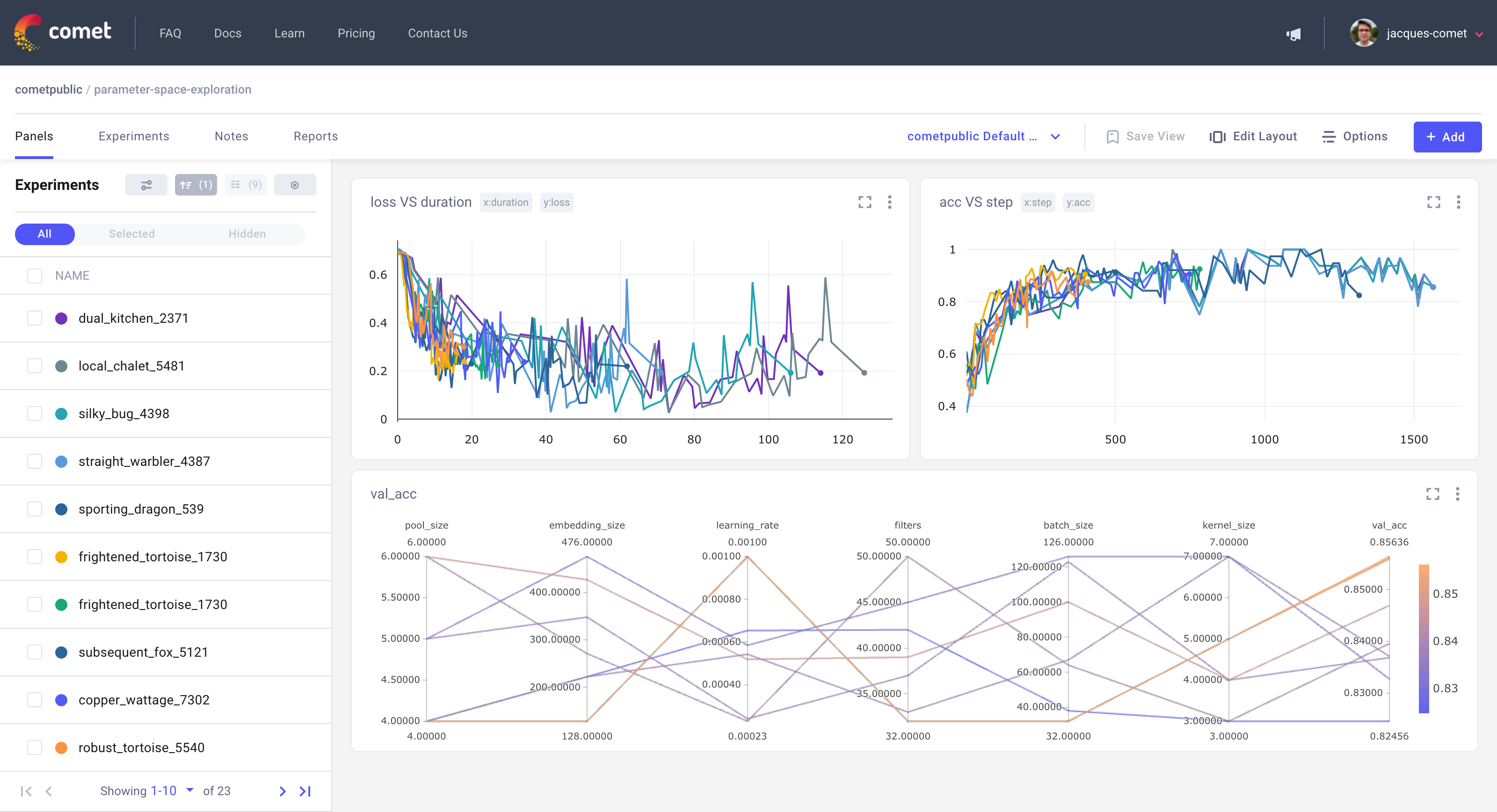
Project Visualizations
Project Visualizations allow you to view and compare the performance across multiple experiments. Comet.ml currently supports many types of visualizations, including: line charts, bar charts, scatter charts, and parallel coordinates charts. In addition, there is an entire marketplace of additional reports, exporters, tools available in the Panel Gallery.
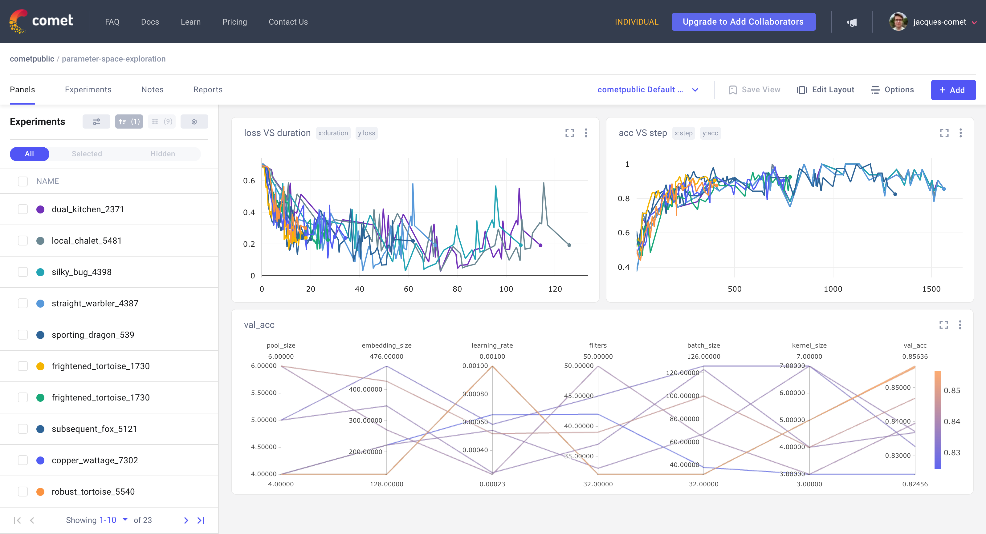
To begin adding additional functionality to your Project View, press
the Add button in the Panels view and select Add Panel. This will
open up a view to the Panel Gallery:
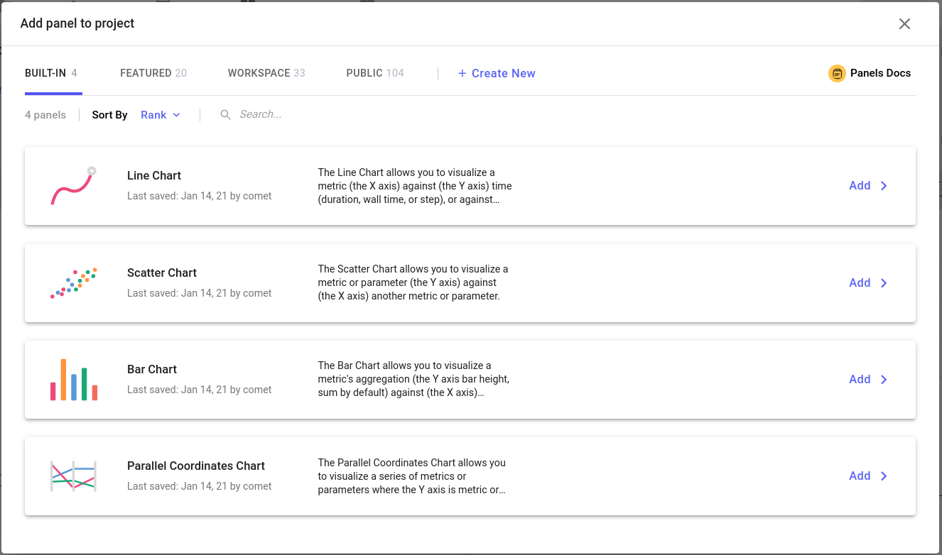
You can select among any of the Built-in, Featured, or your personal collection of Panels.
When you select a Panel for adding to your Project View, we render a preview of the panel for you. As referenced in the previous section on Experiment Filters, the filters you select will impact which experiments appear in the Project Visualization area.
Info
The Panels are editable. If you wish to change an aspect of a panel, simply press on the three-dot option in the top right of the panel and select Edit. In this dropdown, you will also have the option to delete the panel, export it as a JPEG or SVG, or reset the zoom.
Panels
Comet Panels are a way of creating custom visualizations, tools, reports, exporters, end more.
For more information, please see:
The rest of this section documents the four Built-in Panels.
Line Charts
The Line Chart type at the project level allows you to visualize a metric (the X axis) against (the Y axis) time (duration, wall time, or step), or against another metric.
You can transform the X or Y axis using either smoothing, log scale, or moving average.
At the project level panel editor, you can set the Panel Name, Legend Keys (experiment names or experiment keys), and Outliers (show or ignore).
Click Reset to clear all settings, Done when complete, or outside
the window area to abort the new panel process.
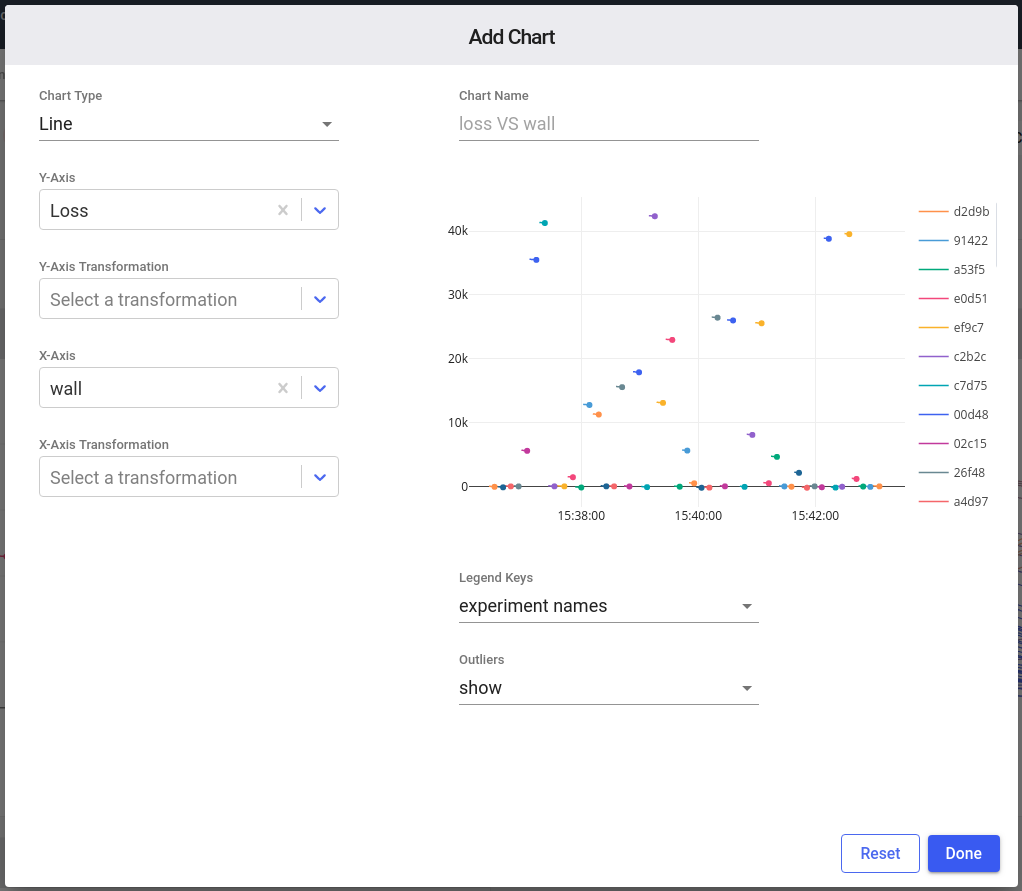
The smoothing algorithm for Line Charts is (pseudocode):
python
def get_smoothed_values(values, smoothing_weight):
    last = 0
    num_accum = 0
    results = []
    for (value in values):
      last = last * smoothing_weight + (1 - smoothing_weight) * value
      num_accum += 1
      debias_weight = 1
      if (smoothing_weight != 1.0):
        debias_weight = 1.0 - (smoothing_weight ** num_accum)
      results.append(last / debias_weight)
    return results
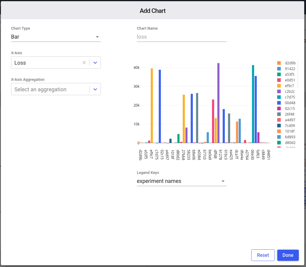
Bar Charts
The Bar Chart type at the project level allows you to visualize a metric's aggregation (the Y axis bar height, sum by default) against (the X axis) experiments.
You can change the aggregation to count, sum, average, median, mode, rms, standard deviation.
At the project level panel editor, you can set the Panel Name, and Legend Keys (experiment names or experiment keys).
Click Reset to clear all settings, Done when complete, or outside
the window area to abort the new panel process.
Scatter Charts
The Scatter Chart type at the project level allows you to visualize a metric or parameter (the Y axis) against (the X axis) another metric or parameter.
You can transform the X or Y axis using either smoothing, log scale, moving average, minimum value, maximum value, first value logged, or last value logged.
At the project level panel editor, you can set the Panel Name, Legend Keys (experiment names or experiment keys), and Outliers (show or ignore).
Click Reset to clear all settings, Done when complete, or outside
the window area to abort the new panel process.
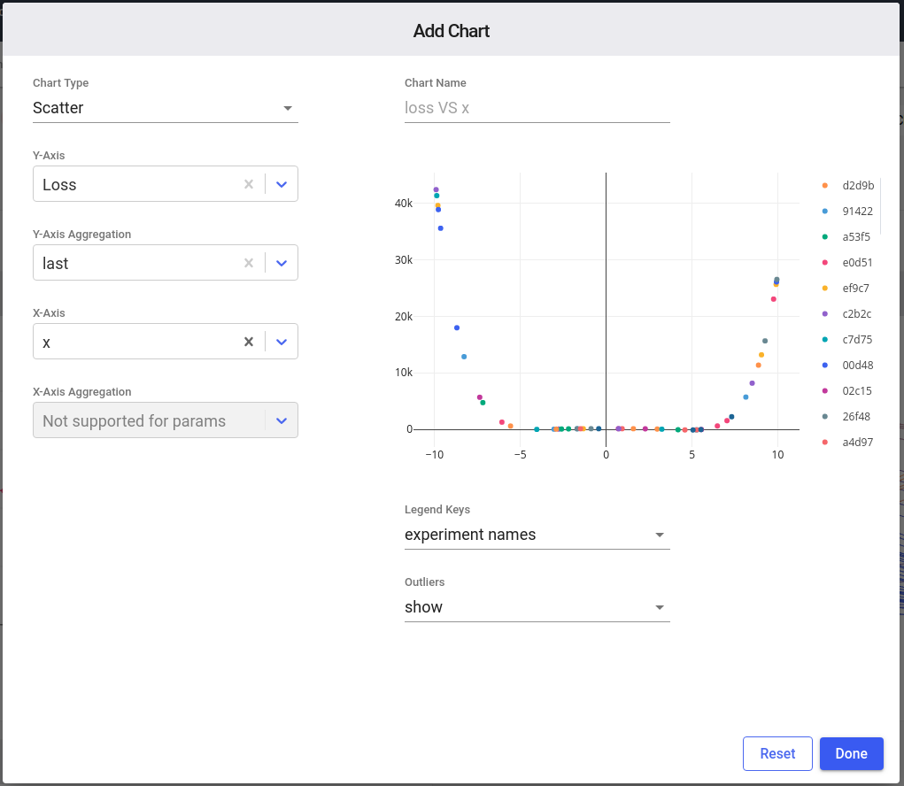
The smoothing algorithm for Scatter Charts is (pseudocode):
python
def get_smoothed_values(values, smoothing_weight):
    last = 0
    num_accum = 0
    results = []
    for (value in values):
      last = last * smoothing_weight + (1 - smoothing_weight) * value
      num_accum += 1
      debias_weight = 1
      if (smoothing_weight != 1.0):
        debias_weight = 1.0 - (smoothing_weight ** num_accum)
      results.append(last / debias_weight)
    return results
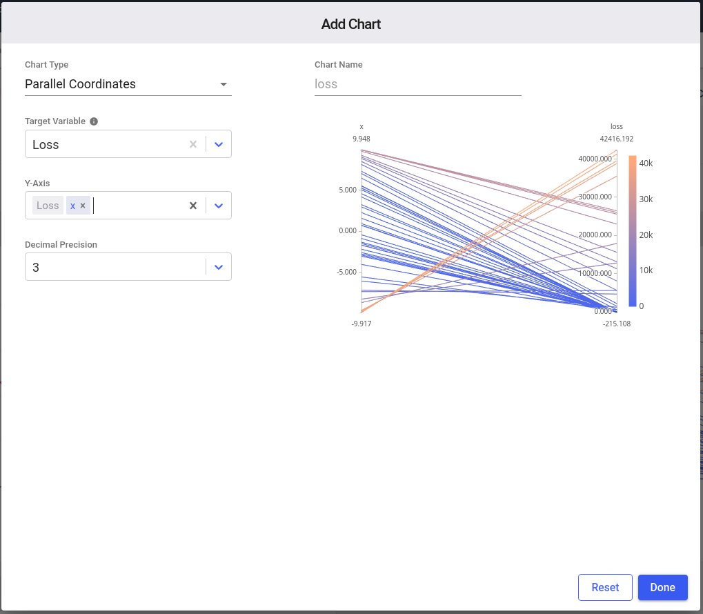
Parallel Coordinates Charts
The Parallel Coordinates Chart type at the project level allows you to visualize a series of metrics or parameters where the Y axis is metric or parameter name, and the X axis is the value of that metric/parameter. The far right vertical line is called the "Target Variable" and is typically the loss or accuracy that you are interested in. This value is often the metric that you are optimizing in a hyperparameter search.
At the project level panel editor, you can set the Panel Name.
Click Reset to clear all settings, Done when complete, or outside
the window area to abort the new panel process.
Mouse over
If you mouseover a line or bar in a Built-in Panel the associated Experiment name or key will be shown.
Zooming In
To zoom-in on a particular region of a Built-in Panel, simply click and drag to select the region. The panel area selected will enlarge to see the details in that area. Double-click the panel to reset the chart to the original area.
Legend values (names vs keys)
You can optionally display Experiment Keys or Experiment names on the Project Panel legend. For existing panels, select the vertical three dots in the upper corner of the panel, and select Edit Panel. When editing or creating a panel, select experiment names or experiment keys under Legend Keys.
You can edit an experiment's name by clicking on the pencil icon as you mouse over the custom name column in the Experiment Table or in the single Experiment View. If you have not set a name for your Experiment, we set your Experiment Key as the default Experiment name.
For more information on setting the Experiment name programmatically, see the Experiment.set_name() function of the Python SDK.
Experiments
An Experiment is a unit of measurable research that defines a single run with some data/parameters/code/results. Creating an Experiment object in your code will report a new experiment to your Comet.ml project. Your Experiment will automatically track and collect many things and will also allow you to manually report anything.
Info
By default, Experiments are given a random name. You can edit an experiment's name by clicking on the metadata icon (three horizontal lines next to the experiment name) and hovering over the experiment name in the metadata section.
For more information on how to log experiments to Comet, see Quick Start.
Experiment Table
The Experiment Table is a fully-customizable tabular form of your experiments for a given Project. The default columns are: Checkbox, Status, Visible, Color, Tags, Experiment key, Server end time, File name, and Duration. However, you can update the Experiment Table with additional columns.
The default columns have the following meaning:
- Checkbox: indicates whether experiment is selected for bulk operations (see below).
- Color: The color assigned to this experiment. Comet allows you to assign a particular color to an experiment so that they are easy to spot across all panels.
- Name: Name of the experiment, can be either auto-generated or user specified.
- Visible: Dark eye indicates that experiment appears in above project panels; grayed eye with slash indicates experiment does not appear in above project panels. Only displayed on hover.
- Status: Green check mark indicates that the experiment is completed; spinning arrows indicate that the experiment is still active.
- Tags: The tags that have been added to this experiment.
- Server end time: The date/time that the experiment ended.
- File name: The name of the top-level program that created this experiment.
- Duration: The total length of time the experiment took from start to finish.
To change the color for an experiment click the colored circle. That will open the color picker window so that you can pick another color. Clicking "Save" will automatically update the color for that experiment in all the panels in the view. Here is the Color selection dialog:
You can perform bulk actions on a selection of Experiments by checking the selection box at the far left of the experiment row. The actions you may perform on your Experiments are:
- Archive: soft-delete Experiments. Navigate to the Project Archive tab to either restore or permanently delete your archived Experiments.
- Move: move your Experiment to another Project
- Tag: add a tag to your Experiment. Select many experiments to tag them all. You can also programmatically populate tags with the
Experiment.add_tag()function. To create a new tag, just enter the text and pressEnter. - Show/Hide: adjust your Experiment’s visibility in the Project Visualizations. The Visible indicator in the Experiment Table is clickable and will either show or hide the Experiment from the Project Visualizations above. You can also select the Experiments in the Project Visualizations to show/hide them.
- Diff: If you select exactly two Experiments, you can select the
Diffbutton for detailed comparison of two experiments. This includes comparing all aspects of the experiments, including Code and Panels. This is a very useful tool to explore the differences between two experiments.
In addition to the above action, you can also apply these actions to all of the experiments:
- Group By: group the Experiments by this column
- Customize Columns: add or remove columns from the Experiment Table
To view a single Experiment in a browser page, click on the Experiment Name in the Experiment Table or Panels sidebar.
Experiment Tabs
Each Experiment contains a set of tabs where you can view additional details about the Experiment:
Charts Tab
The Charts tab shows all of your charts for this experiment. You can add as many charts as you like by clicking the Add Chart button. Like the Project View, you can set (and save) the View, set the smoothing level, set the X axis, and how to handle outliers.
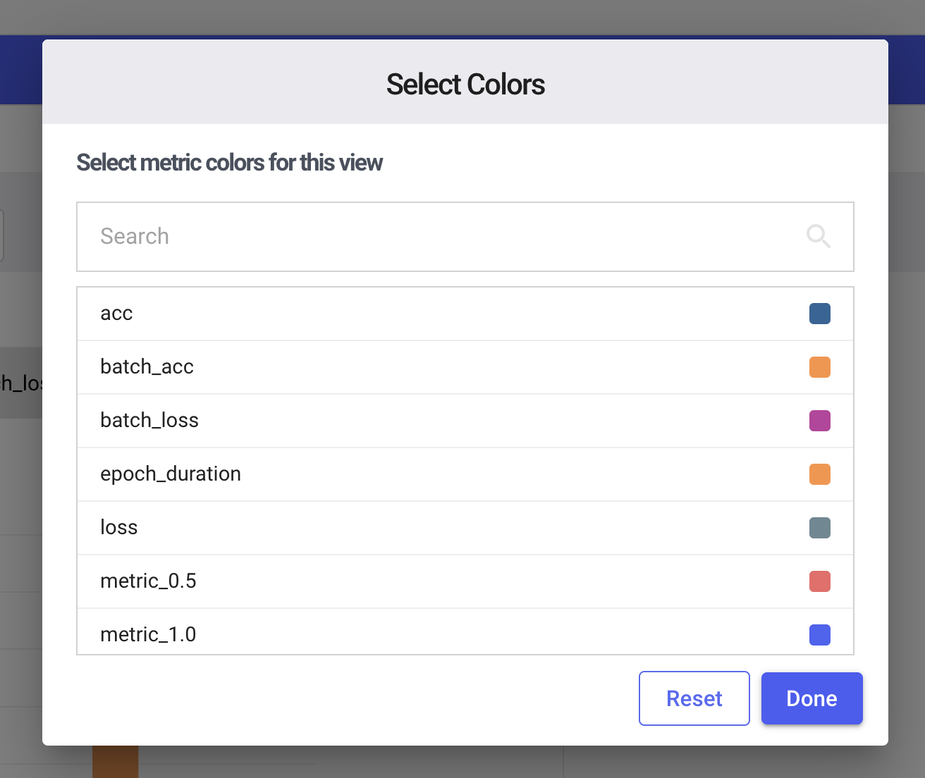
In addition to the Add Chart button on the Charts tab, you can also change the color that is associated with an experiment.
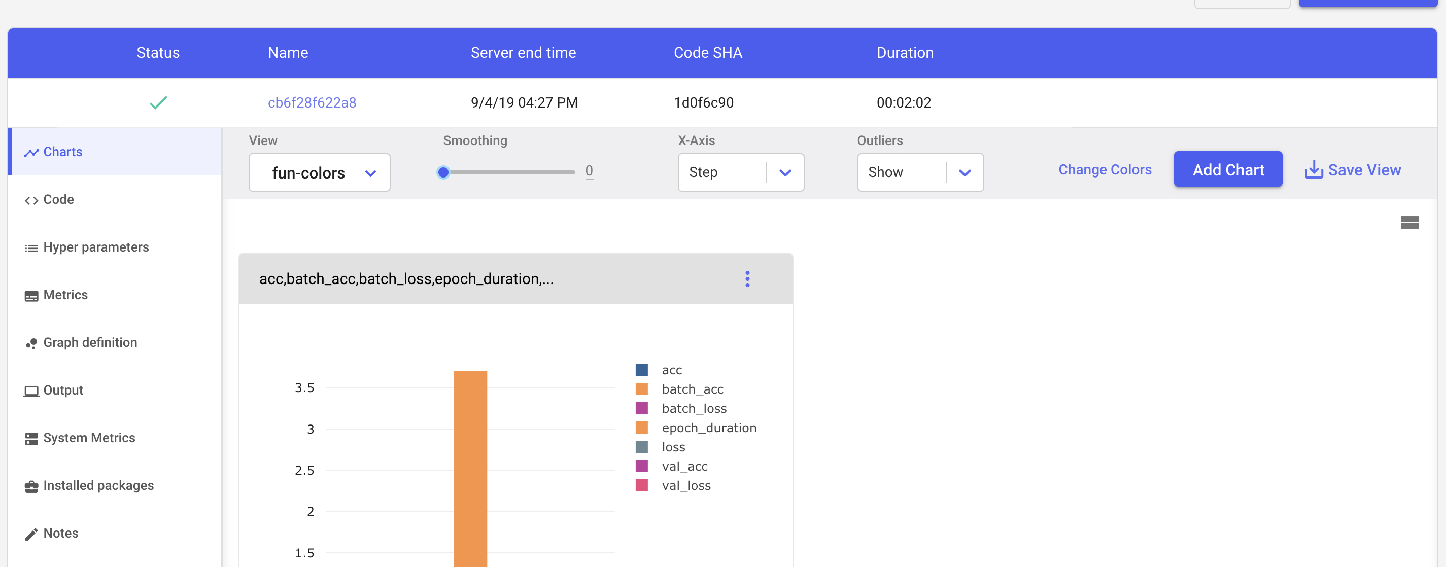
Simply click the Change Colors link, select the metric name, and select the color from the color palette.
For many Machine Learning frameworks (such as tensorflow, fastai,
pytorch, sklearn, mlflow, etc.) many metrics and hyperparameters are
automatically logged for you.
However, you can also log any metric, parameter, or other value using the following methods:
To see more information on Machine Learning frameworks see the advanced section on frameworks and how to control (auto logging)[python-sdk/Experiment/#experiment__init__] when creating an experiment.
Code Tab
The Code tab contains the source of the program used to run the Experiment. Note that this is only the immediate code that surrounds the Experiment() creation. That would be the script, Jupyter Notebook, or the module, that instantiated the Experiment.
Info
Note that if you run your experiment from a Jupyter-based environment (such as ipython, JupyterLab, or Jupyter Notebook), the Code tab will contain the exact history that was run to execute the Experiment. In addition, you can download this history as a Jupyter Notebook under the Reproduce button on the Experiment View. See more about the Reproduce button here
Hyperparameters Tab
The Hyperparameters tab shows all of the hyperparameters logged during this experiment. Although you may log a hyperparameter multiple times over the run of an experiment, this tab will only show the last reported value.
To retrieve all of the hyperparameters and values, you may use the REST API, also available in the Python SDK.
Metrics Tab
The Metrics tab shows all metrics that were logged during the experiment. The table shows a table with the following attributes per metric:
- Name: name of metric
- Value: value of metric
- Min Value: minimum value of the metric over the experiment
- Max Value: maximum value of the metric over the experiment
To retrieve all of the values, you may use the REST API, also available in the Python SDK.
Graph Definition Tab
The Graph Definition tab will show the model graph description, if available. Note that only one model per experiment is currently supported.
Output Tab
The Output tab will display all of the standard output during the run of an experiment.
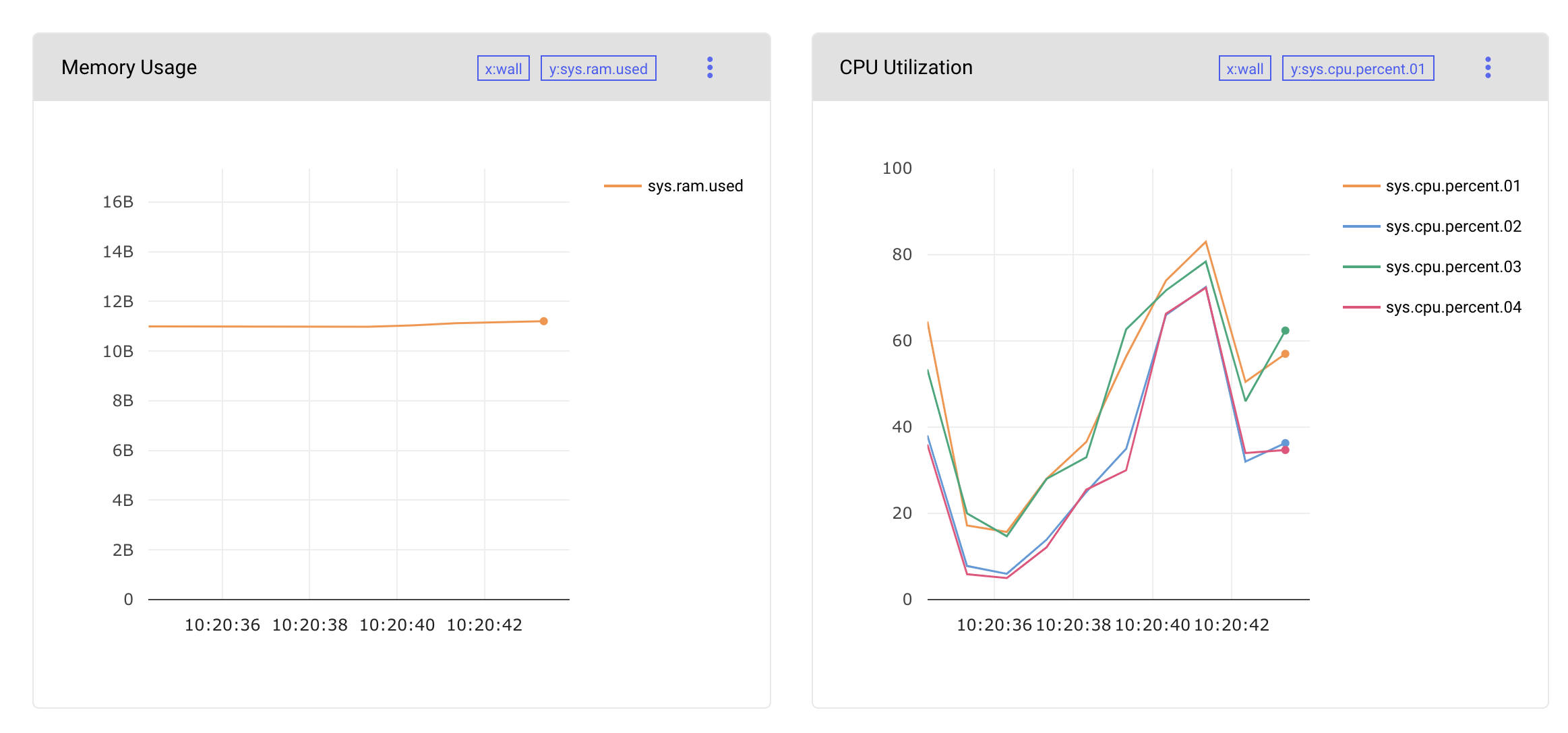
System Metrics Tab
The System Metrics tab shows items such as operating system user and type, Python version, IP address, and hostname. In addition, the System Metrics tab will show charts of your CPU and GPU usage over the course of your experiment. Note that the CPU and GPU usages are reported to Comet.ml about every 60 seconds.
Installed Packages Tab
The Installed Packages tab lists all of the Python installed packages and their version numbers. Note that the format is the same as used by pip freeze for easily creating reproducible experiments.
Notes Tab
The Notes tab is available for markdown notes on this Experiment. Notes can only be made through the web UI.
HTML Tab
The HTML tab is available for appending HTML-based notes during the
run of the Experiment. You can add to this tab by using the
Experiment.log_html() and
Experiment.log_html_url() methods from
the Python SDK.
Graphics Tab
The Graphics tab will be visible when an Experiment has associated
images. These are uploaded using the
Experiment.log_image()
method in the Python SDK. There are several actions you can take to
find matching images:

You may:
- Sort by Name or Step
- Order by Ascending or Descending
- Filter by figure name (including Exact and Regex matches)
- Filter by step
In addition, you may automatically advance the the step filter by pressing the next, previous, and play buttons.
Audio Tab
The Audio tab shows the audio waveform uploaded with the Experiment.log_audio() method in the Python SDK.
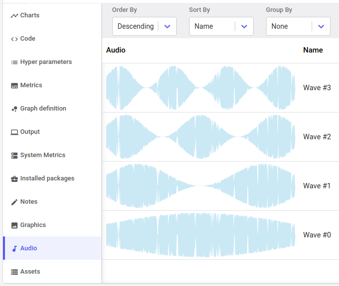
In the Audio tab, you can:
- View the audio files in ascending or descending order
- Sort by name or step
- Group by name, step, or context
- Search by name using either exact match or regular expressions
- Filter by step
For each waveform, you can hear it by hovering over the visualization and pressing the play indicator. Click in the waveform to start playing at any point during the recording.
Text Tab
The Text tab shows strings logged with the Experiment.log_text() method in the Python SDK.
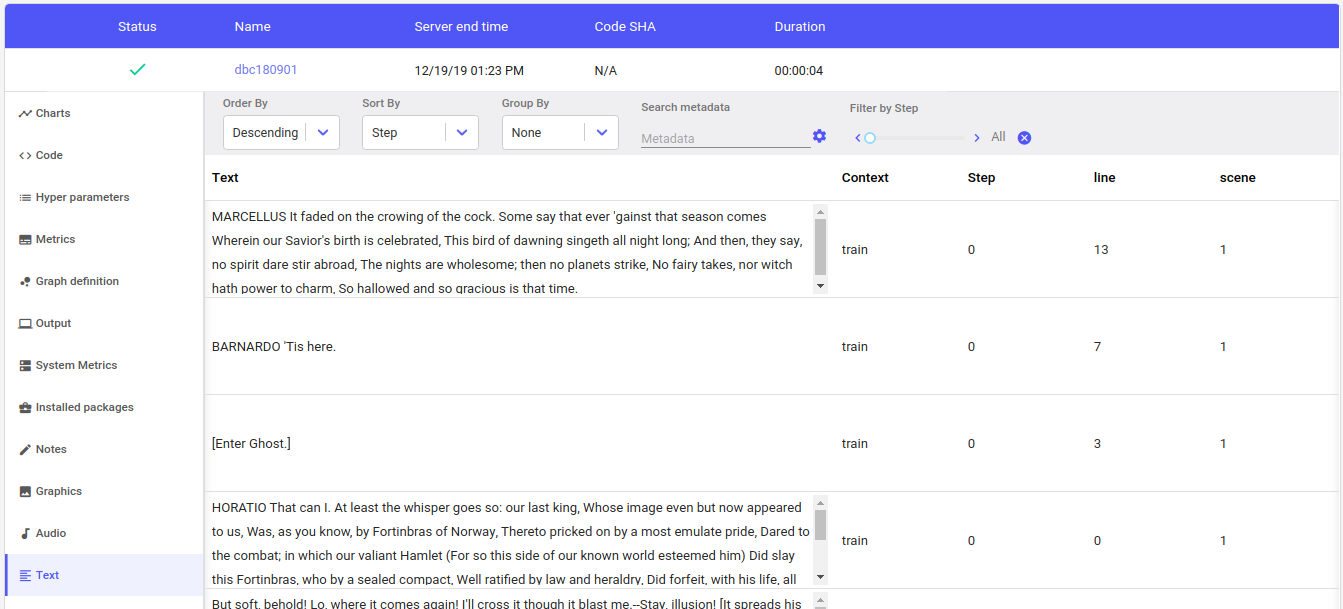
You can use Experiment.log_text(TEXT, metadata={...}) to keep track
of any kind of textual data. For example, for a Natural Language
Processing (NLP) model, you could log a subset of the data for easy
examination. Any metadata logged with the text will show in the columns
next to the text logged.
Confusion Matrices Tab
The Confusion Matrices tab shows so-called "confusion matrices" logged
with the
Experiment.log_confusion_matrix()
method in the Python SDK. The confusion matrix is useful for showing
the results of categorization problems, like the MNIST digit
classification task. It is called a "confusion matrix" because the
visualization makes it clear which categories have been confused with
the others. In addition, the Comet Confusion Matrix can also easily
show example instances for each cell in the matrix.
Here is a confusion matrix after one epoch of training a neural network on the MNIST digit classification task:
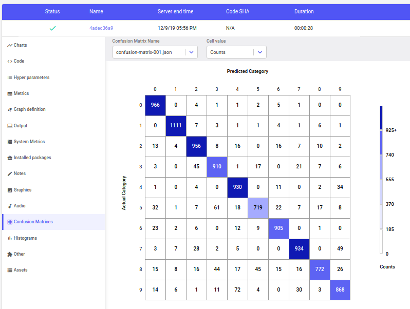
As shown, the default view shows the "confusion" counts between the actual categories (correct or "true", by row) versus the predicted categories (output produced by the network, by column). If there is no confusion, then all the tested patterns would fall into the diagonal cells running from top left to bottom right. In the above image, you can see that actual patterns of 0's (across the top row) have 966 correct classifications (upper, left-hand corner). However, you can see that there were 5 patterns that were "predicted" (designated by the model) as 6's.
If you hold your mouse over the 0-row, 6-column, you will see a popup window similar to the following:
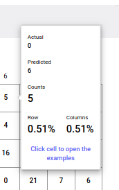
This window indicates that there were 5 instances of a 0 digit that were confused with being a 6 digit. In addition, you can see the counts, and percentages of the cell by row and by column.
If you would like to see some examples of those zero's misclassified as six's (and the confusion matrix was logged appropriately), simply click on the cell. A window with examples will be displayed, as follows:
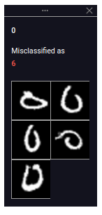
You can open multiple example windows by simply clicking on additional cells. To see a larger version of an image, click on the image in the example view. There you will also be able to see the index number (the position in the training or test set) of that pattern.
Some additional notes on the Confusion Matrices tab. You can:
- close all open Example Views by clicking "Close all example views" in the upper, right-hand corner
- move between multiple logged Confusion Matrices by selecting the name in the selection on upper left
- display counts (blue), percents by row (green), or percents by column (dark yellow) by changing "Cell value"
- control what categories are displayed (e.g., select a subset) using
Experiment.log_confusion_matrix(selected=[...]) - compute confusion matrices between hundreds or thousands of categories (only the 25 most confused categories will be shown)
- display text, URLs, or images for examples in any cell
See the Comet Confusion Matrix tutorial for details on
logging your own confusion matrices, and the
Experiment.log_confusion_matrix()
documentation.
Histograms Tab
The Histograms tab shows time series histograms uploaded with the
Experiment.log_histogram_3d()
method in the Python SDK. Time series are grouped together via the
name given, and assumes that a step value has been set. Step values
should be unique, and increasing. If no step has been set, the
histogram will not be logged.
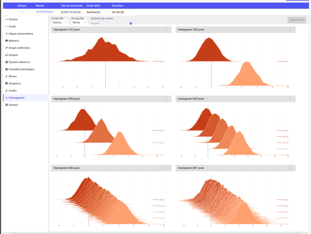
Each histogram shows all of the values of a list, tuple, or array (any size or shape). The items are divided into bins based on their individual values, and the bin keeps a running total. The time series runs from earliest (lowest step) in the back, to early steps in the front.
Time series histograms are very useful for seeing weights or activations change over the course of learning.
To remove a histogram chart from the Histograms tab, click on the chart's options under the three vertical dots in its upper right-hand corner, and select "Delete chart". To add a histogram chart back to the Histograms tab, click on the "Add Chart" button on the view. If it is disabled, then that means that there are no additional histograms to view.
Assets Tab
The Assets tab will list all of the images and other assets associated
with an experiment. These are uploaded to Comet.ml by using the
Experiment.log_image()
and Experiment.log_asset()
methods from the Python SDK, respectively.
If the asset has a name that ends in one of the following extensions, it can also be previewed in this view.
| Extension | Meaning |
|---|---|
.csv |
Comma-Separate Value File |
.js |
JavaScript Program |
.json |
JSON File |
.log |
Log File |
.md |
Markdown File |
.py |
Python Program |
.rst |
Rust Program |
.tsv |
Tab-Separated Value File |
.txt |
Text File |
.yaml or .yml |
YAML File |
The Stop Button
The Experiment Stop button allows you to stop an experiment that is
running on your computer, cluster, or on a remote system while it is
reporting to comet.ml. The running experiment will receive the message
and raise an InterruptedExperiment exception, within a few seconds
(usually less than 10).
If you don't need to handle the exception, you can simply let the script end as usual---just as if you had pressed Control+C. However, if you would like to handle the interrupted script, you can do that as well. Here is an example showing a running experiment, and catching the exception. You could perform custom code in the except clause, if you wished.
```python from comet_ml import Experiment from comet_ml.exceptions import InterruptedExperiment
experiment = Experiment()
try: model.fit() except InterruptedExperiment as exc: # handle exception here experiment.log_other("status", str(exc)) # other cleanup
model.save() experiment.log_asset("my_model.hp5") ```
See also the API.stop_experiment()
method.
The Reproduce Button
The Experiment Reproduce button allows you to go back in time and re-run your experiment with the same code, command and parameters.
The Reproduce button is available on the single experiment page:
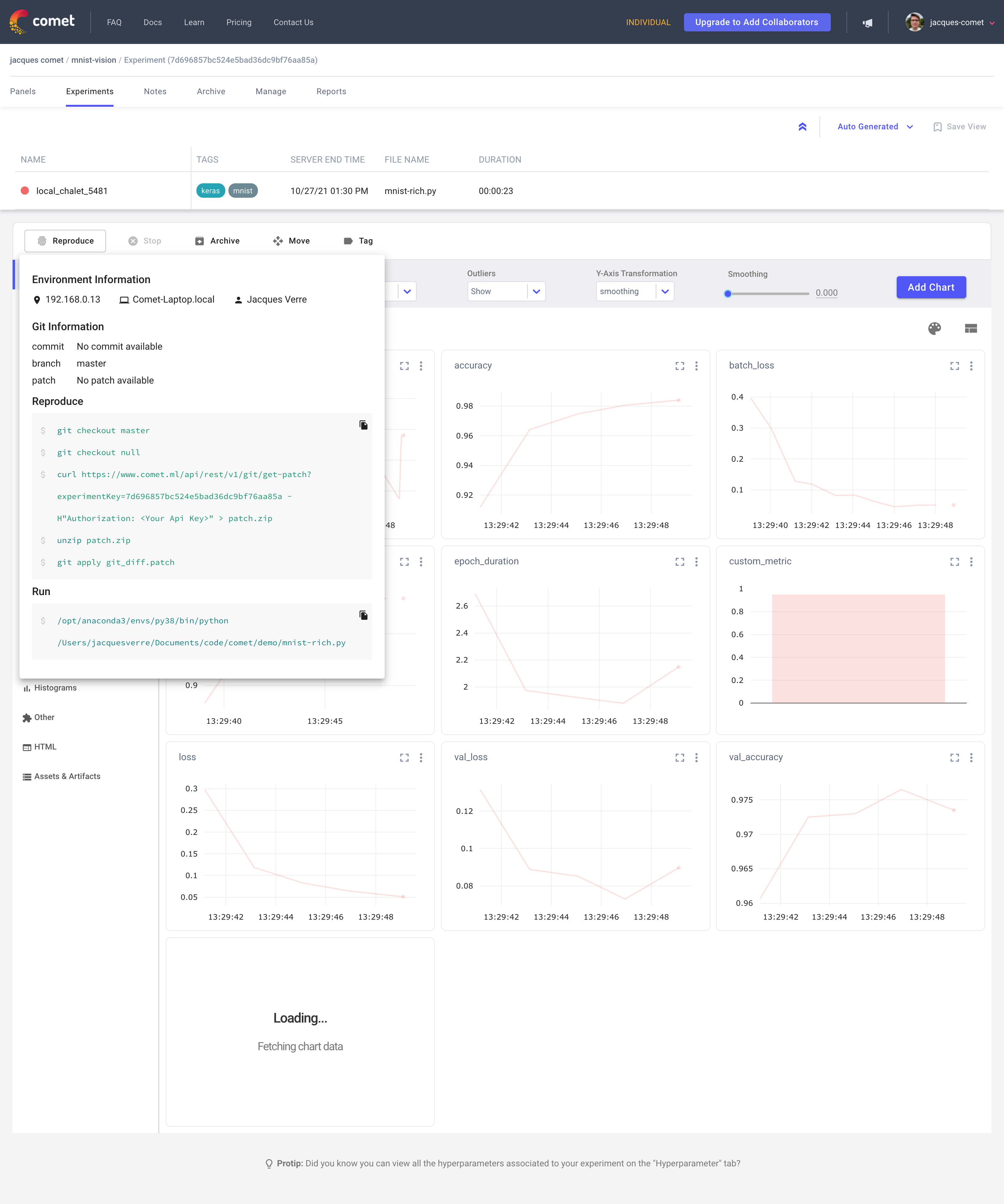
The reproduce screen contains the following information:
- Environment information: IP, hostname, and user name.
- Git information: Link to last commit, current branch and a patch with uncommitted changes.
- Reproduce: The list of commands required to restore the working directory back to the previous state when running the experiment.
```bash git checkout master
git checkout b2628a10b7e678392ab378e07defdcabb54ab9dc
curl https://www.comet.ml/api/rest/v1/git/get-patch?experimentKey=someKey -H"Authorization: RestApiKey" > patch.zip
unzip patch.zip
git apply git_diff.patch ```
Info
The set of commands above checks out the correct branch and commit. In case there were uncommitted changes in your code when the experiment was originally launched, the patch will allow you to include those as well.
Run command: used to start this experiments
bash
/path/to/python /home/train/keras.py someArg anotherArg
Troubleshooting
If you see the message "Some invalid values were ignored" below a Built-in Panel, then Comet has detected Infinity, -Infinity, or other invalid values in the logged data (such as a metric or parameter). For display purposes we have skipped over these values. However, you can still get the entire series of data using the REST API.