Introducing Panels: Custom Visualizations for Machine Learning
In the last three years since Comet was founded, our users and customers trained millions of models on anything from self-driving cars to speech recognition, and from Covid-19 protein prediction to satellite image object detection. Based on your requests we added more and more visualization capabilities including chart builders, confusion matrices, audio players and many more. But as the complexity of the use cases, requirements and customization grew, we realized that we needed a more scalable way to grow Comet’s functionality and provide users the ability to build anything they want!
Today, we are excited to announce Comet Panels, which has been under development and testing for the past year. Starting today, you can tap into the ecosystems of JS/HTML/CSS and create new widgets with custom styles and behaviors, or add new visualizations and charting types. Unlimited possibilities!
The key principles in designing Comet Panels were the following:
1. Dynamic – Panels should be dynamic and update on new experiments and results when they arrive. There’s nothing worse than a stale and misleading visualization.
2. Flexible – Users should be able to build and customize anything they want without the limitations of a GUI or a specific dependency
3. Reusable – teammates and community members should be able to share and reuse each other’s panels.
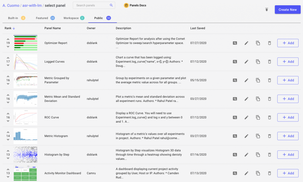
The Comet Panel Gallery
The heart of Panels lies in the Comet Panel Gallery. Check it out to see what others have built and shared with the community.
Build your own Panel
Comet experiments already store your hyper-parameters, metrics, model definition, trained models, dataset samples and much more. Panels build on top of that data to visualize and process anything you’d like.
You can create a new panel by going to the Panels Gallery and clicking on “Create New” on the top right corner. You should see a similar code editor:

The code editor is divided into three main panes. On the left we have a full code editor with code completion, syntax highlighting etc. On the right we have a live preview of our panel. On the bottom right we see our Console pane which shows errors and exceptions. You’ll also notice the tabs on the top that allow you to switch from code to description, HTML, CSS, resources and query.
To make a snappy user experience in the browser, we will write our Panel in JavaScript.
You can create a new Panel from the Panels Gallery as described in Comet’s User Interface. You’ll need to go to the Panels Gallery on the Project View and click on “Create New.” You should then see a screen similar to the following:
Once you are on this screen, you are now ready to write the code (there is some default code provided on the creation of a new Panel, but you can simply select it all with CONTROL+A and press Delete). Your new Panel code only needs these two things:
- A JavaScript class named
MyPanel - A
draw(experimentKeys, projectId){}method that takes an array of experiment keys and project ID
That’s it! We have also defined a Comet.Panel to extend that contains additional functionality. You use it like this:
class MyPanel extends Comet.Panel {
  draw(experimentKeys, projectId) {
    // Your code here
  }
}
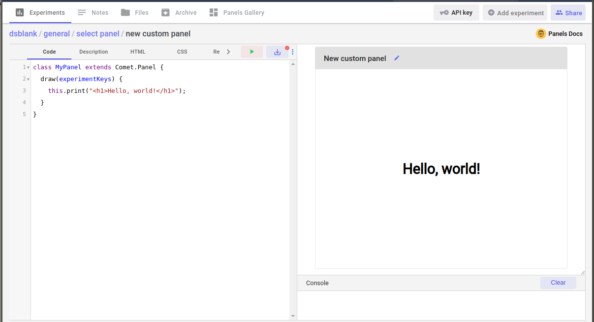
In the tradition of introductory programming exercises, let’s explore a “Hello world” Panel. We take the basic template from above, and add our instructions to print “Hello, world!” in our panel. We will use this.print() to display the message.
We’ll also use the HTML <h1> tag to make our message large and bold.
class MyPanel extends Comet.Panel {
  draw(experimentKeys, projectId) {
    this.print("<h1>Hello, world!</h1>");
  }
}
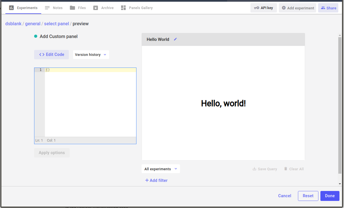
If you write (or copy and paste) the above code into the Panel Code section, and click on the green arrow button (or press CONTROL+ENTER) you should see the following:
Now, you can save your Panel by clicking on the save button (or pressing CONTROL+S), which will prompt you for a name:
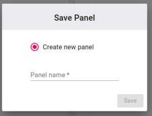
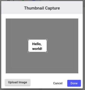
Name your Panel something like “Hello World”, and click “Save”. The first time you save a new Panel, you’ll be asked to capture a thumbnail of your Panel. You can either select a portion of the screen, or upload your own image:
If you press “Done” then you will go back to the Panels Gallery. Now you can add a “Hello World” Panel to your project by clicking the “+ Add” button in the Panels Gallery. A window will appear giving you the chance to set some options (discussed in the next section). For now, just press “Done”.
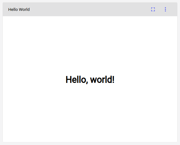
Your Project View should now include your “Hello World” Panel:
In the next section, we’ll explore the idea of an “option.”
Options
It would be very painful if you had to edit code to have slight variations of a Panel. For example, imagine that you wanted to plot the metric “acc” in one chart, but the metric “loss” in another. To allow the Panels to be more abstract, we have provided the Panels with the idea of options.
To provide these options that can be changed when creating a Panel and without changing code, you only need to define a JavaScript object in the MyPanel instance named options. Typically, you will define your options in the setup method, as shown below. These are default values that can be overridden by the user when creating a new instance of the Panel.
class MyPanel extends Comet.Panel {
  setup() {
    // Your setup code here
    this.options = {
      // Your default options here
    }
  }

  draw(experimentKeys, projectId) {
    // Your code here
  }
}
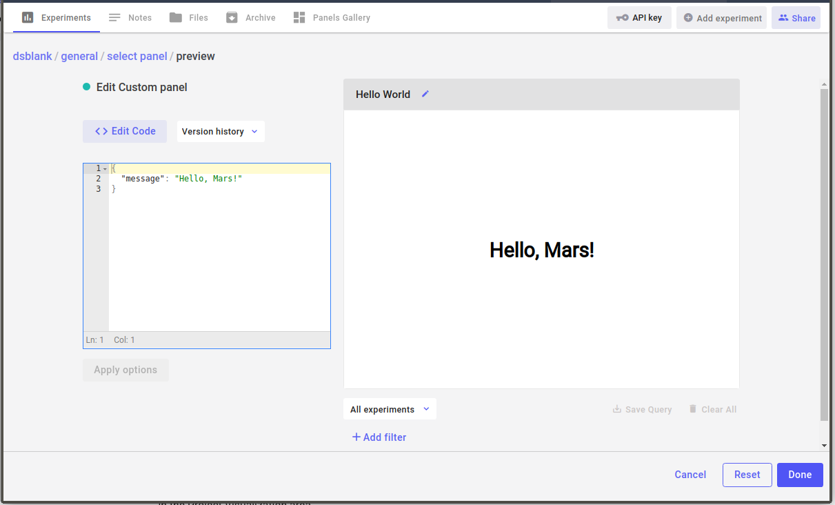
As a concrete example, let’s change the “Hello World” Panel to include a setup() method with the option “message”:
class MyPanel extends Comet.Panel {
  setup() {
    this.options = {
      message: "Hello, world!"
    }
  }

  draw(experimentKeys, projectId) {
    this.print(`<h1>${this.options.message}</h1>`);
  }
}
If you try this Panel, you’ll see exactly the same result as before. However, there is a big difference: you can now add two instances of the “Hello World” Panel to your Project View, and make each one say something different by merely changing the options when you add the Panel to your Project:
Specifically, the steps are:
- Create the Hellow World Panel, using the option “message”
- Add one of these Panels to your Project
- Add another of these Panels to your Project, this time changing the message to something else
The Comet.Panel Class
When you extend from Comet.Panel you get additional functions, including:
this.print(object, newLine)– print text in main Panel area; newLine == true means follow with newlinethis.getOption("name", default)– get a name from the options (returnnullif not defined); return default if not foundthis.clear(divId)– clear all of theprint()ed items in the panel area, or give it the ID of a div to clearthis.drawOne(experimentKey)– conventional method for single experiment drawing codethis.select(label, options, parentId)– create a HTML select widget for selecting widgets; callsthis.drawOne(selectedItem)this.getColor(experimentKey)– get the color associated with this experiment
Your class must be named MyPanel to use these features. You can, of course, do your own JavaScript processing. In addition, you can also define the following methods to gain additional functionality:
update(experimentKeys, projectId) {}– method to define code that will not clear the panel, but can be used to update existing UI components (see below)
The Panel.draw() Method
A Panel’s draw() method receives two things:
- an array of experiment keys
- a Project ID
The array of experiment keys is one of three things, in this order:
- if a Panel filter is set, the experiments keys are all those matching the Panel filter
- if a Project View filter is set, the experiment keys are all those matching the Project Filter
- if no filter is set, the experiment keys are those visible in the Project experiment table
Note that there are two ways that an experiment is visible in the experiment table on the Project View:
- the experiment must be on the current table page (the table shows a limited number of experiments per page)
- the experiment must not be hidden (the “eye” icon must not be grayed out)
If you want to always process all experiments (or programmatically select a subset from all of them), you can instead use the Project ID to get all of the experiments in a Project, like this:
draw(experimentKeys, projectId) {
  this.api.experimentsByProjectId(projectId).then(experimentKeys => {
    // process all Project experimentKeys here
  });
}
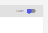
If you are processing the array of experiment keys (experimentKeys) then be aware that these can change and a refresh will occur on any of these events:
- you change the experiment table page limit (number of experiments per page)
- you change, add, or remove the experiment filter
- you change any experiment’s hide/show status (either by clicking the “eye” icon in the experiment table, or by selecting experiments to hide via another Panel)
If you are instead processing the experiments via the projectId key, then you will probably want to flip the toggle on the Panel instance editor to make it “static”:
The Panel.update() Method
Here is a template using the Panel.update() method. We restructure the code so that the Panel.draw() creates a Plotly plot instance, and a place to cache a set of experiment keys. Panel.update() is called whenever new data is received, but we make it so that the update method only processes experiments that it hasn’t seen before.
class MyPanel extends Comet.Panel {
  ...

  draw(experimentKeys, projectId) {
    Plotly.newPlot(this.id, [], this.options.layout);
    this.cached_experiments = [];
    this.draw(experimentkeys, projectId);
  }

  update(experimentKeys, projectId) {
    experimentKeys = experimentKeys.filter(key => ! this.cached_experiments.includes(key));
    this.api
      .experimentMetricsForChart(
        experimentKeys,
        this.options.metrics,
        this.options.parameters
      )
      .then(results => {
        Object.keys(results).forEach(experimentKey => {
          ...
          this.cached_experiments.push(experimentKey);
          Plotly.addTraces(this.id, data);
        });
      });
  }
}
Note that if you don’t have a Panel.update() method that the entire Panel HTML area will be cleared and Panel.draw() will be called each time new data is available. You can use the Panel.update() method to do more intelligent processing for a snappier user interface experience.
JavaScript API
The Comet.Panel class also creates an interface to Comet’s JavaScript SDK through this.api. This has all of the methods needed to access your data, plus some that are especially useful in creating a Panel. There are a few methods of special interest here:
this.api.store(name, data)– save to this Panel instance’s persistent memorythis.api.getFromStore(name)– get an item from this Panels’ persistent memory
For more details on the complete library, please see Comet’s JavaScript SDK.
In addition, there are a variety of Comet open source JavaScript libraries that you can use (and build upon) via the Resources Tab.
Single Experiment Workaround
this.select() is designed to allow you to select a single experiment from the Project, and works as follows:
class MyPanel extends Comet.Panel {
  // Define your draw method like this
  draw(experimentKeys, projectId) {
    if (experimentKeys.length > 0) {
      this.select("Select an experiment: ", experimentKeys);
      this.drawOne(experimentKeys[0]);
    }
  }

  drawOne(experimentKey) {
    // Insert code here to do something with one experiment key
  }
}
Debugging
Note that console.log() displays the items in the Console portion of the user interface.
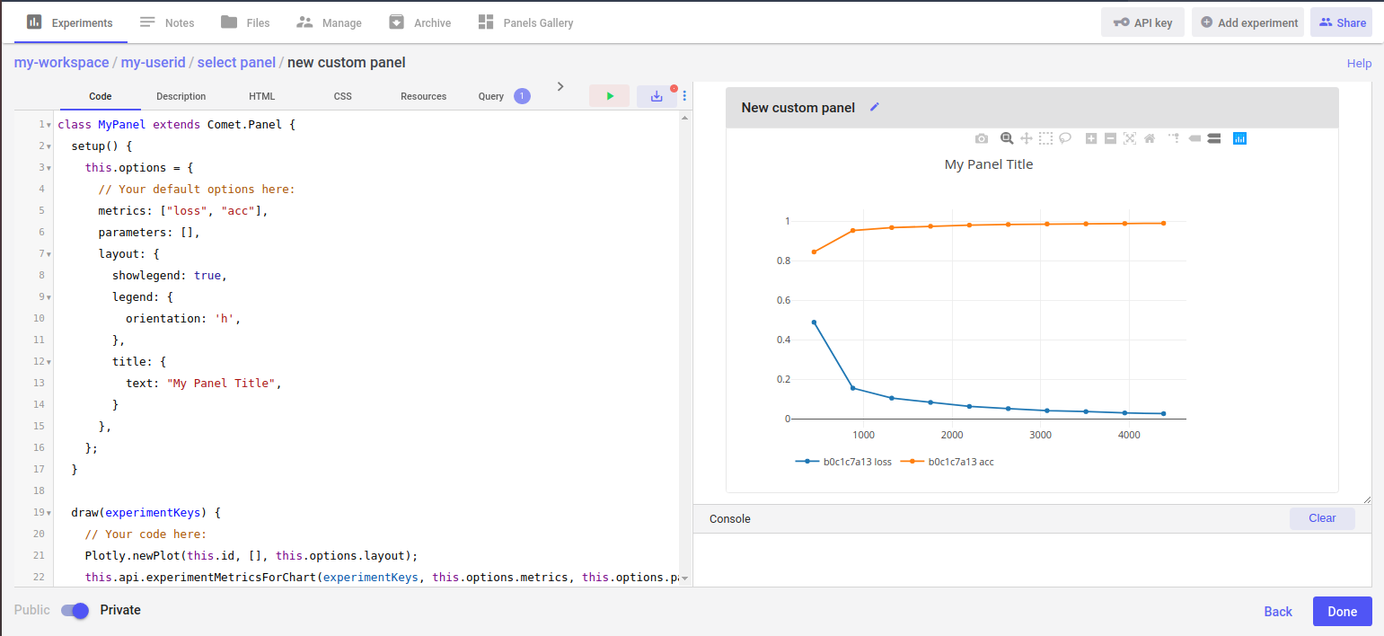
Full Example
Here is a basic line chart example using Plotly:
class MyPanel extends Comet.Panel {
  setup() {
    // Your setup code here
    this.options = {
      // Your default options here
      metrics: ["loss", "acc"],
      parameters: [],
      layout: {
        showlegend: true,
        legend: {
          orientation: 'h',
        },
        title: {
          text: "My Panel Title",
        }
      },
    };
  }

  draw(experimentKeys, projectId) {
    // Your code here
    Plotly.newPlot(this.id, [], this.options.layout);
    this.api.experimentMetricsForChart(
      experimentKeys, this.options.metrics, this.options.parameters)
      .then(results => {
        Object.keys(results).forEach(experimentKey => {
          const name = this.api.experimentName(experimentKey).then(name => {
            results[experimentKey].metrics.forEach(result => {
              const data = {
                y: result.values,
                x: result.steps,
                name: `${name} ${result.metricName}`,
              };
              Plotly.addTraces(this.id, data);
            });
          });
        });
      });
  }
}
In this example, we’ve defined this.options that defines a list of metrics and parameters to chart, and a layout object. We are using Plotly, so we can put anything there that Plotly can use. See Plotly for more information.
Any option can be overridden by the user when they instantiate the Panel on their own page. Therefore, you can easily use the same code for plotting multiple items by simply changing the options.
For more details on using Comet Panels, please see Panels.
JavaScript Tips
JavaScript is designed to give a performant experience on the web. If you adapt your coding style to the way of the JavaScript, you will be rewarded with a fast-loading, snappy experience. But it does take a little bit of extra work.
Comet’s JavaScript SDK is written using Promises. These are JavaScript objects that represent a promise to complete some code. The code might be finished already, or you might have to await for it to complete. You can do whatever you would like, but JavaScript has some simple syntax for running multiple functions in parallel.
Let’s take a look at some examples. Often, you may want to get some data, and then process it, and finally display it. Ideally, you can do this all in parallel. The example from above does exactly that. Consider that code again:
 1 class MyPanel extends Comet.Panel {
 2   ...
 3   draw(experimentKeys, projectId) {
 4     // Your code here
 5     Plotly.newPlot(this.id, [], this.options.layout);
 6     this.api.experimentMetricsForChart(
 7       experimentKeys, this.options.metrics, this.options.parameters)
 8       .then(results => {
 9         Object.keys(results).forEach(experimentKey => {
10           const name = this.api.experimentName(experimentKey).then(name => {
11             results[experimentKey].metrics.forEach(result => {
12               const data = {
13                 y: result.values,
14                 x: result.steps,
15                 name: `${name} ${result.metricName}`,
16               };
17               Plotly.addTraces(this.id, data);
18             });
19           });
20         });
21       });
22   }
23 }
Some important things to note:
- Line 5 displays an empty Plotly chart, which will get added to in parallel
- Lines 6 and 10 represent
Promisesthat are followed by a.then()method that says what to do after the promise is resolved - Line 17 adds the result of each individual chain of processing to the chart
This is the ideal method of JavaScript processing for the web. However, you can’t always work in such a style. For example, if you wanted to find the average of all of a particular metric, then you must collect all of those metrics first. Here is an example of how to do serial processing:
 1 class MyPanel extends Comet.Panel {
 2   ...
 3   async draw(experimentKeys, projectId) {
 4     const data = await this.collectData(experimentKeys);
 5     this.print(`<p>Average: ${avg(data)}</p>`);
 6   }
 7 }
Things to note:
- Line 3 has added the
asynckeyword in front of thedraw()method. This is necessary for any function/method that needs toawaiton a result - Line 4 has an
awaitkeyword in front of a method call
That’s it, for the structure. Let’s now take a look at how collectData() could be written. Consider that you have logged an “other” value (not a metric or parameter) using experiment.log_other("x", value) for all of the experiments in this project. Now we want to fetch all of those values, and average them.
 1   async collectData(experimentKeys) {
 2     const values = await Promise.all(
 3       experimentKeys.map(experimentKey => {
 4         return this.api.experimentOther(experimentKey, "x");
 5       })
 6      return values.filter(v => typeof v == "string");
 7     );
Things to note:
- Line 1, again we add
async - Line 2, we perform an
awaiton aPromise.all(item.map()), a very common pattern - Line 6, a bit of technical detail, to filter out
NaNand other bad values
The last example blocks to get all of the values, before proceeding. This is different from the first example. If your code takes a while to process, you can put a this.print("<h2>Processing...</h2>") before the collection, and this.clear() after it.
For more examples, see the shared code examples in the Gallery.
Working with Plotly
Plotly is a free and open source JavaScript library built on d3.js and stack.gl.
As shown above, for performance reasons, you typically want to create the Plot and incrementally add traces to it.
Plotly has many options, such as limiting the X and Y axis using the layout.xaxis.range and layout.yaxis.range values, like this:
class MyClass extends Comet.Panel {
  draw(experimentKeys, projectId) {
    const data = ... // get some data here
    const layout = {
      xaxis: {range: [1, 10]},
      yaxis: {range: [5, 7]}
    };
    Plotly.newPlot(this.id, data, layout);
  }
}
Here are some of the most useful links for working with Plotly:
- Chart Fundamentals
- Basic Charts
- Statistical Charts
- Scientific Charts
- 3D Charts
- Subcharts
- Chart Events
- Animations
Working with other JavaScript Libraries
There really is no limit to what you can build with Comet Panels. Here are some additional links to JavaScript libraries that you might find useful:
Related Articles